Hey Game Afternooners, I'm back again and I'm excited to share with you guys one of my all time favorite games called Mirror's Edge. Before I get into that though, I wanted to put out a couple of ideas for next week's design inspiration: I'm considering talking about good controller gameplay mapping or diving into some ideas surrounding sound design and why some audio is more compelling than others. Let me know what you guys would like to see. NOW ONTO THE HEAT

INTRO:
Mirror’s Edge is a video game published in 2008 by Electronic Arts and developed by DICE. It is an incredible Action-Adventure Platforming game where you use parkour and a little bit of James Bond inspired hand to hand combat to navigate a sprawling futuristic cityscape. You play as the lead character Faith who transmits messages and other packages through the rooftops of the city away from the eye’s of the Government. You may think to yourself “Steve I’ve seen plenty of parkour games where you punch stuff, Assassins Creed has done it like 12 times now” and to you Garry I respond with “THIS GAME IS IN FIRST PERSON”. That is a stark difference from other parkour games. The point is this idea of having a first person camera is so well done that my bones from inside my body scream about how cool and interesting this gameplay is. Play it. I dare you. 
THE MEAT:
Okay so I wanted to talk about some color use in this game and it’s going to come in two parts. As I jump into those two parts I'll try to include some compelling images but if you really want to get a full grasp of how color works in this game I highly recommend watching some gameplay online via YouTube. Here is a link: https://youtu.be/uNZHU55tMMM?si=56hu522Gp5K_9dfX&t=46 
Part 1:
Lets as i typically like to do start at the title screen. There are a couple of things to notice here: we have what we can assume is probably the main character looking super Badass over a vast city lookout. She has some really cool tattoos and this is probably the most in your face Red I’ve ever seen which completely distracted me from the fact that the city itself shows almost no detail like it's still being rendered in. interesting lets see if any of that shows up later.
As you start the game you are greeted with an introduction animation to set the scene. In this animation you are introduced to Faith Connors, our protagonist and main character, she tells about how the city changed and started to turn on some of its less desirable residents. After laying a backdrop she introduces a society of “Runners” people who skirt the edge of both communities along the rooftops, sewers, and the pathways between the two. She then mentions something very abstract: “The Flow” , a way that runners see the city and the way that they are able to maintain their way of life, even going as far as to say that it “keeps [them] alive”. Secretly behind the scenes DICE is introducing us to something that will be crucial to playing this game. In order for us to make it from point A to point B as Faith we need to be able to see this flow just as much as she claims to be able to.
AND NOW I POINT YOU TO IMAGE 1:


Now how many of you have seen a radio tower like this one that is bright red or even some scrap wood in the exact same shade of red. Don’t actually answer that question, the answer should be no. This is the magic! This is how DICE can show us “The Flow” which thematically is the path that we should follow to get to our destination. Things in flow state aren’t always in that bright red shade because we can’t always interact with them. For example this scrap wood in the image doesn’t turn red until we are almost close enough to interact with it and the animation of it turning red helps us notice it as a player. It quite literally gravitates the player's interaction towards it.
This use of color is consistent throughout the game. You as the player always know what things you can interact with because they turn this amazing shade of red. Nothing else in the environment uses this shade of red or any shade of red, they have saved it exclusively for interactable objects. Now that's a red hot design.

Part 2:
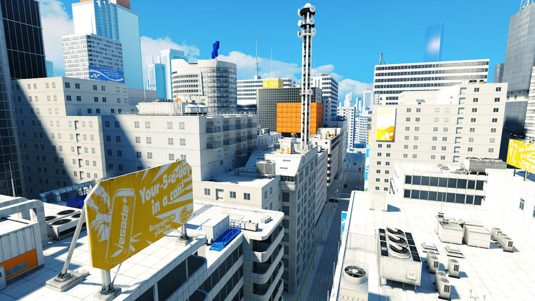
Remember how the buildings in the background of the title screen were super muted? It’s similar to what we have in the actual city too and it serves a purpose to thematically prove the city as a fully controlled environment. Every building is the same shade of white with occasional soft focuses of color which is expressive of the city's singular and deprived nature.The other purpose behind having such a monotone and unsaturated city is that it allows the players focus to be easily attained. Think about staring at a white sheet of paper with various shades of unsaturated dull colors and a very saturated and a bright red circle in some random location. Your visual peepers are drawn towards the pop of color. Having a high contrast of saturation and brightness allows the user's attention to be drawn wherever you want. Now that you know the trick of it you can break this up and take it do a different level.

Take any of these level color schemes and it works! When you overlay the Bright HIGH CONTRAST Red over the parkourable items in these levels you are able to create a clear path for the player.
OUTRO:
Use color like Mirror’s Edge. When we create a design that seems overly complicated we should be using color to more effectively direct our users to the positions or actions that are most important. We can also use these same color techniques to “hide” or distract our users from unimportant information (keep in mind though if they don’t need it we should also ask ourselves “can we just get rid of this?”). By doing so we can take even a cluttered environment and make it simple to the user's eyes. Mirror’s Edge absolutely has its pitfalls as a game but overall led the way to a more interesting pattern for color use and directing players attention. Just play it you’ll see
TLDR:
Mirror’s Edge uses a mix of bright and high saturated colors, along with dull unsaturated colors to properly direct the players attention. As designers it is important to think of how we can use that to our advantage. In Mirror’s Edge it became a way for the player to be directed towards an end goal and a method to teach the player what they can and can’t interact with.

Thank you for coming to my TED Paragraph and until next week It's Ya Boi Steve Michie.


